| Previous :: Next Topic |
| Author |
Message |
Tigerotor77W
Member


Joined: 16 May 2009
Posts: 775 | TRs | Pics
Location: Charleston, SC |
| Chainsaw_Willie wrote: | | IMO, a good frame around a picture shouldn't call attention to itself, it should enhance or accent the picture itself.
What do you folks think of this one?
|
Agreed (also with Jim) on the frame, but I hope we didn't scare Tangeman away! :-/ I didn't mean to be harsh what with numbering my thoughts and all. Apologies if it came off that way.
CW, I also like it. I meant to try to get a good wave picture, but alas a solid hit never came. I think Jim's comment about increasing the contrast would help a bit.
And I'll be the horizon police on this one, but know that it's not distracting enough to make a big difference.
|
| Back to top |
  
|
|
Bedivere
Why Do Witches Burn?

Joined: 25 Jul 2008
Posts: 7464 | TRs | Pics
Location: The Hermitage |
|
Bedivere
Why Do Witches Burn?
|
 Mon Nov 21, 2011 3:13 pm |
|
|
Thanks for the input!
I can't believe I missed the horizon... This is a crop from a slightly larger image, so no problem to go back and fix the horizon while retaining these proportions.
The original image was even flatter/more washed out than this. I kind of felt the softness of it would lead to the feeling of it being a rainy/stormy day but I'll give it a little more contrast bump for grins.
BRB..... EDIT:
Here it is with a touch more contrast and the horizon evened out.
And here it is as a B&W with even more contrast added in and some tweaking to even out the exposure. I'm really liking this one.
|
| Back to top |
|
|
Gil
Member
Joined: 29 Sep 2004
Posts: 4067 | TRs | Pics
|
|
Gil
Member
|
Mon Nov 21, 2011 6:27 pm |
|
|
| Chainsaw_Willie wrote: | | Thanks for the input!
I can't believe I missed the horizon... This is a crop from a slightly larger image, so no problem to go back and fix the horizon while retaining these proportions.
The original image was even flatter/more washed out than this. I kind of felt the softness of it would lead to the feeling of it being a rainy/stormy day but I'll give it a little more contrast bump for grins.
BRB..... EDIT:
Here it is with a touch more contrast and the horizon evened out.
And here it is as a B&W with even more contrast added in and some tweaking to even out the exposure. I'm really liking this one.
|
I think a vertical 8x10 crop on that image could work -- perhaps even a square crop -- to focus on the power of the wave. I took the liberty of experimenting -- hope you don't mind, Chainsaw_Willie.
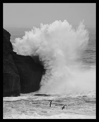 Photo by Chainsaw-Willie -- resized to show a vertical crop.
Friends help the miles go easier.
Klahini
Friends help the miles go easier.
Klahini
|
| Back to top |
|
|
JPH
Member

Joined: 14 Feb 2008
Posts: 809 | TRs | Pics
|
|
JPH
Member
|
Mon Nov 21, 2011 6:45 pm |
|
|
Here's a few from a trip earlier in the fall. Any tips or suggestions how I could get more out of my pics would be awesome. Looking back at the album I defintely went heavy on the veritcal cropping...
I just use a lumix point and shoot (DMC-ZS10), so that's what I'm working with.
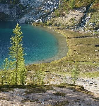 lower lake shore 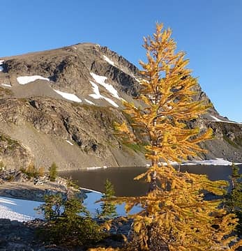 Maude and a larch 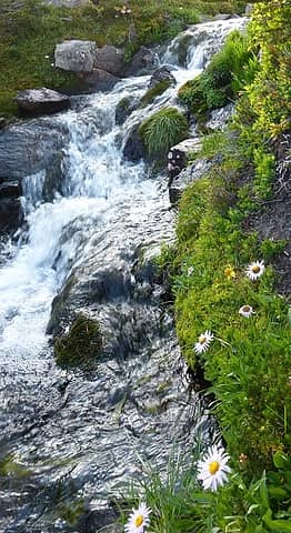 Lower lake outlet 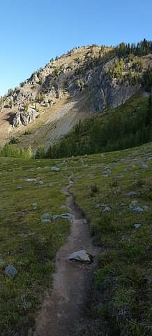 Carne Mtn meadow trail
|
| Back to top |
|
|
Bedivere
Why Do Witches Burn?
Joined: 25 Jul 2008
Posts: 7464 | TRs | Pics
Location: The Hermitage |
|
Bedivere
Why Do Witches Burn?
|
Mon Nov 21, 2011 8:52 pm |
|
|
Gil - I don't mind at all, that's a great suggestion. I'd like a little more breathing room around the wave though so went back to the original image and took an 8x10 portrait crop out of that. I like it, but still working on it. Also cropped the landscape version a little tighter to reduce the amount of dark rocks on the left side. Will post up versions of these later.
|
| Back to top |
|
|
Jim Dockery
Member

Joined: 12 Sep 2007
Posts: 3092 | TRs | Pics
Location: Lake Stevens |
Willi, I really like the black & white, Gil's crop is also nice (but I also like the horizontal), and the frame adds another nice touch. The only problem I see now with the increased contrast is the rocks loosing detail in the lower left. To add contrast I'd open up the original then add a levels adjustment layer, turn it up to emphasize the wave as needed, then brush it out in the rocks to bring back some of the lines over there.
|
| Back to top |
|
|
Gil
Member
Joined: 29 Sep 2004
Posts: 4067 | TRs | Pics
|
|
Gil
Member
|
Tue Nov 22, 2011 8:07 am |
|
|
Chainsaw, just passing along some complements on your photo from Bob Noble and Richard Alton over on flickr.
Friends help the miles go easier.
Klahini
Friends help the miles go easier.
Klahini
|
| Back to top |
|
|
GaliWalker
Have camera will use

Joined: 10 Dec 2007
Posts: 4935 | TRs | Pics
Location: Pittsburgh |
|
GaliWalker
Have camera will use
|
Tue Nov 22, 2011 9:19 am |
|
|
For what it's worth, Gil's crop is the one that works for me. It somehow manages to focus attention on the impact point of the wave, as well as the birds. It does change the feel of your photo though, so I can understand if it wasn't what you wanted.
|
| Back to top |
|
|
GaliWalker
Have camera will use
Joined: 10 Dec 2007
Posts: 4935 | TRs | Pics
Location: Pittsburgh |
|
GaliWalker
Have camera will use
|
Tue Nov 22, 2011 9:44 am |
|
|
| JPH wrote: | lower lake shore |
I'd crop a bit of the shoreline away. A bit too much empty space there. Doing so will probably make a feature of the larches.
There's a lot of empty space in the foreground. I presume that you wanted to have the eye led to the trees, but the foreground isn't interesting enough. I don't have a suggestion on how to improve it after the fact; the suggestion I'd have is to have shot the photo when the sun was at a lower angle, which might have picked out the groove in the dirt a bit more, or crouched down a bit more, to focus more attention on that groove.
| JPH wrote: | Lower lake outlet |
Again, no suggestion now, but in future you might want to pick out a single flower more than you have (get closer?) or a clump of flowers while composing the shot. Currently, they are too scattered.
My 3 cents...
|
| Back to top |
|
|
Jim Dockery
Member
Joined: 12 Sep 2007
Posts: 3092 | TRs | Pics
Location: Lake Stevens |
JPH, those are all good, can't see any technical flaws. I esp. like the first one because the lake frames the trees, and the lines in the shore lead the eye back there. Good light too.
I like the second one also and see what you were doing with the lines in the dirt leading up, but that area is still a bit too bland for me so I'd either crop it tighter, or on location zoom into the rocks more.
Good depth of field in the stream, gotta love the small sensors for that!
|
| Back to top |
|
|
JPH
Member
Joined: 14 Feb 2008
Posts: 809 | TRs | Pics
|
|
JPH
Member
|
Tue Nov 22, 2011 9:48 pm |
|
|
Thanks for the input! I took another shot at a couple of them. I think the stream one is a lost cause regarding different cropping...I guess I'll have to go back to the lakes to re-take it.  I got rid of some of the dirt in the foreground. Originally I was trying to get the drainage pattern under the rock, but I can see that it isn't all that clear. I think this looks better than the first crop.
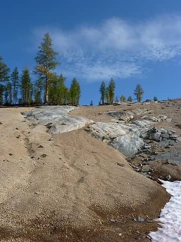 tree original 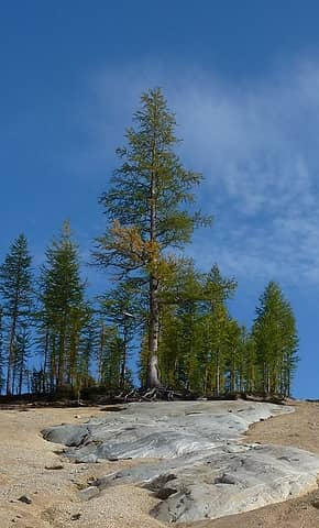 tree cropped 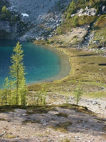 lake original 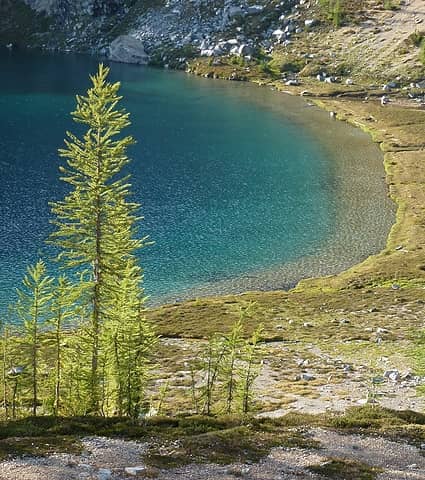 lake cropped
|
| Back to top |
|
|
Gil
Member
Joined: 29 Sep 2004
Posts: 4067 | TRs | Pics
|
|
Gil
Member
|
Wed Nov 23, 2011 3:29 pm |
|
|
Wow, that last photo shows just what a good edit will do for a photo. The image leaps of the screen now. Well done.
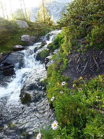
On the image of the waterfall, I would crop down from the top to just above the flow that's directly facing the camera. I think that might improve the prominence of the flowers at lower right. Do you by chance have more of the flower at the very bottom center in the original image?
Friends help the miles go easier.
Klahini
Friends help the miles go easier.
Klahini
|
| Back to top |
|
|
JPH
Member
Joined: 14 Feb 2008
Posts: 809 | TRs | Pics
|
|
JPH
Member
|
Wed Nov 23, 2011 8:11 pm |
|
|
The first cropping was already at the bottom of the picture, so I can't do much with that. With my first crop I just tried to get rid of the washed out area above the waterfall. Here it is cropped down more:
 original 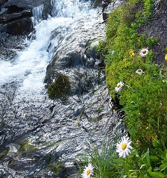 new crop
|
| Back to top |
|
|
the Zachster
Member

Joined: 17 Jan 2007
Posts: 4776 | TRs | Pics
Location: dog training |
I know it's all in the eye's of the beholder  but is this one too soft? but is this one too soft?
 Rhody Park
"May I always be the kind of person my dog thinks I am"
"May I always be the kind of person my dog thinks I am"
|
| Back to top |
|
|
Jim Dockery
Member
Joined: 12 Sep 2007
Posts: 3092 | TRs | Pics
Location: Lake Stevens |
Zachster, I wonder if it isn't soft enough. I'd choose which side I want sharp - the green leaf, or the right side flower (I'd vote for the flower since the leaf isn't that interesting and partially obscured), then blur everything else so that the subject stands out more. Right now my eyes jump back and forth between them.
|
| Back to top |
|
|
|
|


