| Previous :: Next Topic |
| Author |
Message |
fairweather friend
Member

Joined: 31 May 2012
Posts: 322 | TRs | Pics
Location: Not so dispersed |
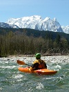
At the moment, NWHikers.net member, BootUp, is catching a little flak in the Trip Reports forum about the photos in his TR being over-saturated to the point of seeming fake. Here's the link: Yellow Aster Butte, Sun and Cloud Play 9/26/13 (Just for the record, they look fine on my monitor, and I was up at YAB only a week before BootUp. If you wish, you can compare them to my own TR: Yellow Aster Butte and Tomyhoi Peak (+weirdness) 9/18-9/19)
Now, I know there have been previous threads about photo-shopping here in the photography forum, but I have specific questions about this one topic: saturation.
First off, if I retouch a photo on my computer in any way, my primary goal is simply to allow the photo to demonstrate, as closely as possible, what I saw when I was there. Mainly, that just means adjusting the exposure a little bit by increasing the shadows and/or highlights. In very rare cases, I might tweak the color balance to make it warmer or cooler or increase the saturation. Like I said, I find that this is hardly ever necessary but I have done it on occasion. (Of course, I also crop and straighten photos, if necessary, but that's not the focus of this post.)
But I'm beginning to realize that this process is not as simple as it sounds: For instance, I wear strongly polarizing sunglasses when I hike so what I'm seeing, and what I remember seeing, might be different than what my camera is recording.
Secondly, every monitor that we use to read TR's and view photos is different, so if I adjust a photo to make it look "right" to me on my computer, it might come out looking garishly over-done on someone else's computer. I didn't realize this until I viewed one of my own TR's on my tablet, which portrayed the colors much more strongly than the laptop where I store all my photos.
Finally, my camera by itself can adjust colors when the image is recorded. For example, one of the choices in the "Scene" menu is "Sunsets." When I have used this setting, I have found that my camera has changed the saturation and color balance so much that the image looks fake to me after I downloaded it at home. Of course, even without using a setting like this, each camera will record colors slightly differently, so what you see with your naked eye (and especially through sunglasses) is not necessary what you're going to see in the image you recorded on your camera.
Anyhow, there are so many good photographers on this site, I am curious to get your feedback on this issue. How do you account for differences in computer monitors? Have you ever checked your work on another computer just to see if you're over-doing things? Have you ever dialed saturation down on an image even though it recreated the scene perfectly to your recollection? (just so it wouldn't look "fake") This is not as simple as what I used to think! 
|
| Back to top |
  
|
|
iron
Member

Joined: 10 Aug 2008
Posts: 6392 | TRs | Pics
Location: southeast kootenays |
|
iron
Member
|
 Tue Oct 01, 2013 11:55 am |
|
|
my pictures look like crap on my work computer, but look nice on my home computer. gotta just end up picking the one you like and hoping you'll be happy with it (and don't EVER change monitors!)... 
|
| Back to top |
|
|
Karen²
A Real Canadian Girl
Joined: 25 Jul 2002
Posts: 1366 | TRs | Pics
Location: Behind the Lens |
|
Karen²
A Real Canadian Girl
|
Tue Oct 01, 2013 12:29 pm |
|
|
You are absolutely correct. This is not a simple topic. People use different monitors, some calibrated, some not. Photos that look really good on my home monitors look like crap on my work monitors
which I have personally set up for the applications I use them for. People use different browsers and yes even that makes a difference.  I've said this before, but it bears repeating. I am hardly ever critical on the colours in a photograph because to me it is not nearly as important as the content, composition, uniqueness and thoughtfulness that go into making a great photo.
I find my camera tends to have a slight red cast, so I will often dial the reds down a bit to make it look better. Another instance I can think of is canyon walls from the SW, especially if you blow them out because they have a lot of light on them and try to bring some definition back, they can look neon. If youve ever been the SW and seen a sunset with your eyes, the rock can glow a brilliant orange/red, but it can be difficult to photograph naturally.
I was once criticized for juicing colours because my lakes were not the same colour as what the other person experienced. When I looked at the other persons photos of the same lakes something became very apparent to me. They had crappy weather and well of course the lakes looked dull to them! Also we visited in different years and lakes can change colour year to year and vary at different times of the same year. A polarizer can help with lakes as well so you can capture the colour and depth without so much reflective light.
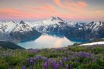
Carver Lake in near Sisters Oregon from the summit of South Sister July 2001
I've said this before, but it bears repeating. I am hardly ever critical on the colours in a photograph because to me it is not nearly as important as the content, composition, uniqueness and thoughtfulness that go into making a great photo.
I find my camera tends to have a slight red cast, so I will often dial the reds down a bit to make it look better. Another instance I can think of is canyon walls from the SW, especially if you blow them out because they have a lot of light on them and try to bring some definition back, they can look neon. If youve ever been the SW and seen a sunset with your eyes, the rock can glow a brilliant orange/red, but it can be difficult to photograph naturally.
I was once criticized for juicing colours because my lakes were not the same colour as what the other person experienced. When I looked at the other persons photos of the same lakes something became very apparent to me. They had crappy weather and well of course the lakes looked dull to them! Also we visited in different years and lakes can change colour year to year and vary at different times of the same year. A polarizer can help with lakes as well so you can capture the colour and depth without so much reflective light.
Carver Lake in near Sisters Oregon from the summit of South Sister July 2001
 Carver  Giant mud puddle 
|
| Back to top |
|
|
hiker1
Member

Joined: 29 Aug 2009
Posts: 1624 | TRs | Pics
Location: West Coast |
|
hiker1
Member
|
Tue Oct 01, 2013 12:38 pm |
|
|
There is at least one thread here for monitor calibration.
https://www.nwhikers.net/forums/viewtopic.php?t=7993042
This article is also good for calibration and profiling.
I set my camera to Neutral colors, which decreases saturation and reduces contrast. This is a good setting to start from when editing later.
And about the two YAB TRs you mention, yours has a lot of rock and evening shots, the other a lot of vegetation shots, so the latter looks more colorful to begin with. Bootup's shots are fine even if he increases the saturation a little.
falling leaves / hide the path / so quietly
~John Bailey, "Autumn," a haiku year, 2001, as posted on oldgreypoet.com
falling leaves / hide the path / so quietly
~John Bailey, "Autumn," a haiku year, 2001, as posted on oldgreypoet.com
|
| Back to top |
|
|
contour5
Member
Joined: 16 Jul 2003
Posts: 2963 | TRs | Pics
|
|
contour5
Member
|
Tue Oct 01, 2013 1:57 pm |
|
|
Can said worms right there on the label... but let's take a little look-see...
Graphics pros typically (or used to, at least) have a whole bank of color-corrected monitors hooked up to at least a couple of operating systems, in order to color-test their work under various conditions.
Remember color profiles? Me neither... I stopped adjusting my monitors ages ago. It's mostly an issue for printing anyway.
Every photo I take is like a hail mary pass. I'm a self-taught know-nothing amateur hack. Some (very few) of my pictures initially turn out ok; many of them look awful. Dull, pasty imitations of what I actually saw with my own eyes. So, I make adjustments.
Saturation can prove addicting. Too much will always give the picture an artificial look. But under-saturation is dull and boring; and an equally "fake" representation of reality.
Without a massive amount of tech and skill, it is nearly impossible to even approach perfect color. In reality- there is no such thing. All photos are fake; merely two dimensional representations of reality. Viewed on different systems, by different eyes, under different conditions.
But that doesn't stop me from trying.
| Quote: | | The bottom line is: dont try to please everyone else because you never will. Process your photos so they look good on whatever media YOU are displaying them on. Ever try to PRINT a photo with proper colours? That is even a larger frustration in my opinion! |
I tend to agree with K² on this point... I adjust my work to thrill myself.
I'm actually colorblind; I frequently confuse various shades of orange, green, brown and other colors. I have to use weird mental tricks to avoid turning my photos into garish nightmare representations of my own gray matter. Pretty hopeless, really.
There certainly is a shirtload of instructional material available for learning to soup up your photos into monster-wicked, hot-rod compositions. I used to watch a lot of Lynda.com videos, but grew oversaturated with marginalia and excess informational bloatage.
I shoot and adjust to thrill myself; and then I share here and elsewhere in some half-witted attempt to thrill others. Sometimes it works, sometimes it doesn't. Fairly inconsequential in the larger scheme of things.
I thought Boot Up's pictures were GREAT! Some of the best work I've seen from him. There were a few shots that were cranked a little high... so what?
He was up front about the whole deal, anyway. The OP's shots look fine as well- just different...
A lot of fine work passes through these pages. None of it is perfect, or even close to "real", but I hope that never stops anybody from trying. I look forward to whatever phoney zamboni 2 dimensional pixelization you care to come up with.
|
| Back to top |
|
|
ericande
Member

Joined: 05 Jan 2008
Posts: 219 | TRs | Pics
|
|
ericande
Member
|
Tue Oct 01, 2013 2:42 pm |
|
|
Two separate issues you brought up in your post. Color accuracy when editing and how much photoshop should you do.
I'd recommend following at least one of the methods listed in the linked thread to calibrate your monitor. At least getting them close to accurate will make editing easier and avoid surprises when you go to print. If you're not a pro it's probably not worth your time or money to do all the steps to make it exact.
As for photoshopping photos.... Are you making art or documenting something for historical purposes (be it editorial content, a book, etc?) If you take a picture and hang it on your wall, do you want it to look amazing or look 'accurate?' You said in your post you try to edit photos to look like it did to your eye. It's impossible for a camera to do that for a couple technical reasons and a bunch of emotional ones. Personally, I say edit your photos how you like. If people ask if I edit my photos I say of course, if they don't like it, that's fine.
|
| Back to top |
|
|
boot up
Old Not Bold Hiker

Joined: 12 Dec 2006
Posts: 4745 | TRs | Pics
Location: Bend Oregon |
|
boot up
Old Not Bold Hiker
|
Tue Oct 01, 2013 8:57 pm |
|
|
Good point about "sunset" and other "scene" settings that people bump their cameras into and then claim "it was straight out of the camera, so its correct".
Good points about, what is "correct"?
Different camera brands....heck models, are entirely different even when set on whatever they call flat or neutral.
Canon colors are entirely different than Panasonic colors. Frankly, I am always battling Panasonic colors because they look "off" to me, especially on the greens. But then with further reading, I am seeing the pros say Panny is more "accurate" than Canon(which I prefer).
Has anyone followed the trends on Pinterest. We apparently have a very dull bunch of people viewing on NWhikers. Almost all popular shots on Pinterest have saturation pushed to extremes, and are usually HDR'ed to death, over sharpened to hell and gone, and contrast to make Ansel Adams jealous. People gobble up that stuff. My pics on Pinterest look downright dull.
Besides fighting Panny "accurate" color balance....by the way, I can spot pics taken by a Panasonic camera now. I also run a cheap laptop computer that has a completely different color balance than the monitor I have it plugged into. I bought a well known name brand color calibration setup, only to find out it could only handle one or the other monitors. And my work flow does not work with only one monitor. And when I view the pics at work, I get entirely different results.
So I generally tweak only a tiny bit of color temperature, and kick up vibrancy a bit.
Mountain foliage needs backlighting and frankly in the cascades rarely lives up to the descriptions. Although ironically I hit a day the colors were truely psychedelic and nobody believes the pics from that hike years ago.
I did punch a couple of pics from YAB a tiny bit, but frankly, a lot of the effect was done by shooting directly into the sun with the help of a nice deep lens hood....an option not used by many, and not available on a P+S.
You can see the lens flare in the "fake" photos. My method of punching up, and yes I was having fun, was to JUST slide the red a tiny bit up and yellow a tiny bit down, since blueberry bushes tend to go for red. So I did not just blindly crank the saturation slider to the right which along with carrots gives people orange skin. BTW, my youngest daughter would only eat peas and carrots for awhile as a baby and indeed she turned into a OompaLoompa.
I hike for fun, I photograph for fun. I think some people are taking it way to seriously and way too literally. I also have an art background which makes visual reality a pliable thing, and I like to experiment with effects and settings. That is fun for me.
Quite frankly I paint what I see.
I feel sorry for people that see the world through such drab literal eyes.
There is so much more to experience.
|
| Back to top |
|
|
joker
seeker

Joined: 12 Aug 2006
Posts: 7953 | TRs | Pics
Location: state of confusion |
|
joker
seeker
|
Tue Oct 01, 2013 11:34 pm |
|
|
I like to use a calibrated monitor for photo editing, but indeed the primary reason is for printing (and as challenging as printing for "accurate" color is from a computer, it has gotten WAY more predictable than it was in the color darkroom with constantly varying film and paper emulsion numbers! and add to that the variations of possible light sources in which the prints will end up being viewed and it gets even more interesting). Ideally I'd also have a print viewing booth setup (and , but that's a little over-the-top for amateur printing. But in any case, I do think this helps a bit even for images that will be viewed on monitors, as I'm at least starting from a known point, and I've seen how these images tend to translate to my laptop screen and a few other monitors (and operating systems and browsers...).
As for saturation - well again monitors vary, as do the tastes of different viewers. However, I do think it's possible to get desensitized a bit to color, as discussed in this article. And if you are going for "likes" on fakebook or the like, overcranking saturation can certainly help, as some viewers will tend to gush about painter-pallete colors (also mentioned in that article). If you're selling your work, it's probably worth pondering deeply. Otherwise relax and have a homebrew (or a nice pint of Boundary Bay ale!).
Some people will continue to get tweaked about seeing colors that are more saturated than what they'd tend to produce from the same scenes on the same days/times. As discussed above, there is not a perfect color rendering of any given scene - this is more subjective than objective. But if you want to try for more objective rendering try getting something like this and include it in a bunch of different photos under different conditions and see how crazy you can make yourself trying to get the best match on your monitor  .
But that orange skin thing (from the carrots, I mean) does freak me out a little!
By the way, even in black-and-white, there is a wide range of ways to interpret a scene. Check out work by Ansel Adams to see how heavily he played with contrast to get the interpretation he wanted (or most other well-regarded B&W landscape photographers). Hardly "neutral," but that's exactly what gives some of the work its impact.
Boot Up - you can shoot into the sun with a P&S and use your hand as a "hood" - not quite as effective but not bad either, as long as you keep your hand just out of the shot. .
But that orange skin thing (from the carrots, I mean) does freak me out a little!
By the way, even in black-and-white, there is a wide range of ways to interpret a scene. Check out work by Ansel Adams to see how heavily he played with contrast to get the interpretation he wanted (or most other well-regarded B&W landscape photographers). Hardly "neutral," but that's exactly what gives some of the work its impact.
Boot Up - you can shoot into the sun with a P&S and use your hand as a "hood" - not quite as effective but not bad either, as long as you keep your hand just out of the shot.
|
| Back to top |
|
|
puzzlr
Mid Fork Rocks

Joined: 13 Feb 2007
Posts: 7220 | TRs | Pics
Location: Stuck in the middle |
|
puzzlr
Mid Fork Rocks
|
Wed Oct 02, 2013 1:35 am |
|
|
I process almost every photo I take. Like others have said, there's no correct way and I tweak them so that I like them. But I'd also like others to connect with them. It's good to think about what you're doing any why. If I consistently got feedback from others that my photos looked fake then I'd make adjustments because that prevents the viewer from connecting emotionally with the photo, i.e. liking it.
I set my jpeg camera mode to "Natural", and also take raw photos when the light is really nice, so all the "settings" are implemented on my computer at home. I have a standard import-from-camera preset that applies a basic recipe that usually produces a picture I like. I like a little extra saturation, but nothing blatant. I also like photos that have deep colors with strong contrast. My tastes have changed over time, which is part of the fun. I work on so many photos I worry that what I get used to might look odd to someone else, so when I show a set to someone I listen pretty carefully to how they react. My kids are good at being very honest about what they like or don't.
I notice right away when a poster has pushed the saturation way up. I don't like it, but I figure they just discovered that slider and over time will tone it down. No harm done.
|
| Back to top |
|
|
RichardJ
Member

Joined: 23 Oct 2012
Posts: 275 | TRs | Pics
Location: Maple Valley |
|
RichardJ
Member
|
Wed Oct 02, 2013 9:29 am |
|
|
Excellent point puzzlr about using the sliders. I am one who used to think I had to go through all the sliders to come up with the best image possible. After lots of honest critiques from my daughter and endless reading on the subject, I am learning how to properly expose the shot and not touch the saturation slider. I love the vivid colors I see here in the WA outdoors and try hard to not push it to the point of looking fake. The most common way for me to ruin a picture was to try to bring too much color or definition to a shadowed mountainside, usually resulting in a whitish band between it and the sky. Now my favorite images are turning out to be the ones where I do the least amount of editing, or none at all. Even though my camera is set to Neutral, I sometimes have to slightly dial down the saturation when grass or moss is so ridiculously bright green.
|
| Back to top |
|
|
mike
Member
Joined: 09 Jul 2004
Posts: 6401 | TRs | Pics
Location: SJIsl |
|
mike
Member
|
Wed Oct 02, 2013 10:57 am |
|
|
If you don't have colorimeter there are websites to help adjust your monitor for better color display. Highly recommended before farting around with an image editor.
a good place to start
windows
cambridge color
calibrize (haven't tried it)
Dry Creek Photo
When you get done be sure to save the profile as the default. Update every few months.
The main problem with many monitors is that off the shelf they are cranked up way too bright and gaudy. Looks good competing for sales on the shelf but worthless for accurate color. e.g. I dialed my back to 30% brightness before calibrating.
Suggested settings if you can find your monitor.
|
| Back to top |
|
|
gb
Member
Joined: 01 Jul 2010
Posts: 6315 | TRs | Pics
|
|
gb
Member
|
Wed Oct 02, 2013 11:31 am |
|
|
It is easy to tell when a photo has been manipulated. I am sure many people don't care, some probably don't notice.
The digital photos that bother me are those that bring to much detail out of the shadows. Some is OK for me, but it is often overdone.
As I still use film (I like the process and have too many great lenses) I used to get into a similar discussion with my old friend Carl Skoog about the use of split filters. Some photographers, even Galen Rowell, often over used the splits in my book (and Carl's). What that means on film is that some photos shouldn't be taken, especially those with from full shade to full sun at midday.
But is all in the eye of the beholder. That is just my personal take.
|
| Back to top |
|
|
hiker1
Member
Joined: 29 Aug 2009
Posts: 1624 | TRs | Pics
Location: West Coast |
|
hiker1
Member
|
Wed Oct 02, 2013 3:47 pm |
|
|
| boot up wrote: | | Has anyone followed the trends on Pinterest. We apparently have a very dull bunch of people viewing on NWhikers. Almost all popular shots on Pinterest have saturation pushed to extremes, and are usually HDR'ed to death, over sharpened to hell and gone, and contrast to make Ansel Adams jealous. People gobble up that stuff. My pics on Pinterest look downright dull. |
Since most people here are taking nature shots (except for TAH's shoe shots, the ones without shoes on...), we want the photos to look more or less natural. On Pinterest, anything goes.
falling leaves / hide the path / so quietly
~John Bailey, "Autumn," a haiku year, 2001, as posted on oldgreypoet.com
falling leaves / hide the path / so quietly
~John Bailey, "Autumn," a haiku year, 2001, as posted on oldgreypoet.com
|
| Back to top |
|
|
GaliWalker
Have camera will use

Joined: 10 Dec 2007
Posts: 4931 | TRs | Pics
Location: Pittsburgh |
|
GaliWalker
Have camera will use
|
Wed Oct 02, 2013 9:22 pm |
|
|
There are other ways than the saturation dial for getting vibrant and 'true' colors. Typically, I don't crank the saturation dial beyond 10%.
The most important thing is to understand the vagaries of natural light. Karen² has provided a few examples above. Here are a couple more:
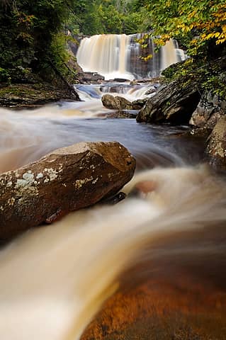
1- Try shooting in early morning and late evening, when the shadows are longer than yourself (i.e. the sun is at an angle lower than 45 degrees). The mellow light and soft shadows really bring out the colors. Most of my 'serious' photography is done at this time. I seldom get splashy shots at mid-day. It does require a bit of dedication though. Example photo:
2- Backlighting can make vegetation glow, but you need to be careful that the sun does not hit the lens. Using a hood, or even shading the sun with your hand helps reduce glare. I always carry a lens cleaning brush and clean my lens before any shot into the sun, to reduce haze and lens flare. Example photo:
Polarizing filters are my most important tool to boost saturation naturally. These don't just "make the sky blue". Their most important function is to remove glare, the main cause of washed out shots. Rotate the filter appropriately before every shot though. Example photo:
 Half rotated the polarizer to keep the blue reflection  )
Graduated neutral density filters help with exposure and not saturation, at least directly, so I won't say anything more. I am a fan of them though...sorry gb.
Finally, if you want to do more, go ahead and play with the saturation and contrast sliders.
Personally, I've stopped trying to satisfy everyone with the look of my photos. I take the type of photo I like to see. If others like it...great, if they don't...oh well. (However, if enough people say negative things about a photo I may rethink my approach.) )
Graduated neutral density filters help with exposure and not saturation, at least directly, so I won't say anything more. I am a fan of them though...sorry gb.
Finally, if you want to do more, go ahead and play with the saturation and contrast sliders.
Personally, I've stopped trying to satisfy everyone with the look of my photos. I take the type of photo I like to see. If others like it...great, if they don't...oh well. (However, if enough people say negative things about a photo I may rethink my approach.)
|
| Back to top |
|
|
Bedivere
Why Do Witches Burn?

Joined: 25 Jul 2008
Posts: 7464 | TRs | Pics
Location: The Hermitage |
|
Bedivere
Why Do Witches Burn?
|
Wed Oct 02, 2013 10:10 pm |
|
|
Since I shoot RAW the settings in my camera for enhancement don't matter as a RAW file is direct from the sensor with no in-camera processing applied.
RAW files tend to be a bit dull & flat looking. Also, if I'm shooting in high contrast situations then I push the exposure one way or the other depending on what I'm trying to bring out. Usually I over expose to bring out shadows as recovering highlights is way easier than trying to bring up shadows (Google "exposing to the right.") Since learning this technique I rarely use a GND, but I still do in situations where it's warranted (usually a sunset or sunrise where I don't want to blow the sky but want some foreground detail.)
Since I spend quite a bit of time in post processing, I spent the money to get a nice Dell IPS wide-gammut monitor and borrowed a Spyder 3 calibrator.
Since doing that I feel my pictures look a LOT better. My old monitor was too bright, which resulted in the pictures coming out too dark on a lot of monitors and when printing. When I look back at my older pictures in my Photobucket album I can clearly see the difference. My monitor at work isn't a fancy one but it's decent and it's easy to see the difference on it also, and the newer pictures look better plus it's easier to get good prints without as much experimenting.
I really don't get why so many people like that garish, over-saturated, over-done "HDR" look. I will process pictures in a way that's not natural at times if I'm trying to create a certain look or mood in an "artsy" picture but the vast majority of my landscape shots are done with the idea of making them look like I remember the scene looking when I was there.
I think at a minimum, if you like taking pictures and want them to look their best to people, you should at least do some reading and try some of the free online calibrators to get your monitor working as best it can.
I very rarely touch the saturation slider in Lightroom. I do use the Vibrance slider somewhat frequently but I'm always careful not to overdo it. More than about 20% and it really starts to make things look funky most of the time, and the majority of the time when I actually use it, no more than 10%
The best thing to do is to try to enhance the dynamic range of the picture as much as possible by tweaking the highlights and shadows to get the broadest curve possible and that by itself usually makes the colors look great.
|
| Back to top |
|
|
|
|
You cannot post new topics in this forum
You cannot reply to topics in this forum
You cannot edit your posts in this forum
You cannot delete your posts in this forum
You cannot vote in polls in this forum
|
Disclosure: As an Amazon Associate NWHikers.net earns from qualifying purchases when you use our link(s). |


